e-Magazine
Clocking In at SpinBoss: The Art Behind the Cartoon Office
By Anna Vetrova · June 11, 2026
Most online casinos reach for the same visual vocabulary: midnight backgrounds, electric purples, gold coins mid-explosion, a promise of glamour pitched somewhere between a nightclub and a vault. SpinBoss does something quieter and, oddly, more memorable. It invites you into an office.
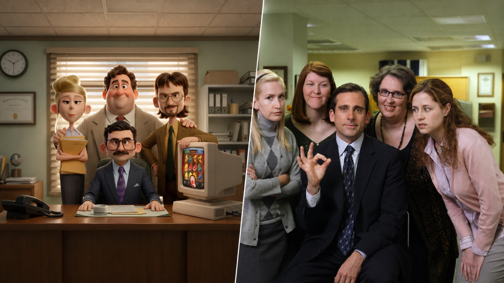
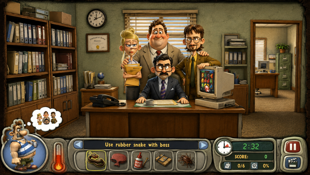
Not a glossy corporate atrium, either — a real, lived-in office, with ceiling tiles, venetian blinds half-drawn against the afternoon, a wall clock, a framed certificate nobody reads, and shelves sagging under colour-coded binders. The kind of room everyone has sat in. And waiting for you there, behind a wooden desk, is the Boss.
Meet the cast
The SpinBoss world is built around four characters, and the whole brand personality lives in how they are arranged.
At the centre, seated, is the Boss himself: navy suit, purple tie, neat moustache, glasses perched with the faint authority of someone who has read every memo. He does not loom. He leans in, hands flat on the desk, more host than executive. The expression is the important part — it is welcoming, a little conspiratorial, the look of a manager who is genuinely on your side rather than measuring your output.
Behind him stands the crew, and they are drawn as a team rather than a hierarchy. There is the organiser, a blonde colleague in a mustard top clutching a stack of folders, clearly the person who actually keeps the place running. There is the big, warm presence in the tan suit and red tie, all easy grin and open posture, the one who remembers your name and your coffee order. And there is the bearded one in glasses and a green tie, slightly rumpled, slightly clever, the character every office has who quietly understands how the machines work.
None of them are caricatures of real people. They are archetypes — the boss, the fixer, the friend, the tinkerer — assembled into a small, believable workplace. That is the trick. You recognise the roles instantly, which means you feel like you already know them, without the brand having to borrow a single recognisable face.
The wink on the desk
The detail that turns the scene from "nice office illustration" into a brand statement sits on the right of the desk: a chunky, beige, retro CRT monitor — the boxy kind that hummed in every office around the turn of the millennium — and on its screen, a bright reel of slot symbols mid-spin.
It is a visual gag with a job to do. The old hardware says warmth, nostalgia, the analogue past; the colourful reel says this is, in fact, a casino. Putting the two together tells you exactly what SpinBoss is trying to be: not a cold, modern gambling machine, but a familiar, friendly place where the games happen to live on the office computer. The anachronism is the point. It softens the product and frames play as something casual and human, closer to gathering around a coworker's screen than stepping onto a casino floor.
Why "office," of all things
The choice of a workplace setting is the most interesting part of the whole concept, because it runs against the grain of the category.
Gambling brands usually sell escape — somewhere richer, brighter and more exciting than ordinary life. SpinBoss sells belonging. The office is the most ordinary place imaginable, and that ordinariness is exactly what makes the cast feel approachable. The office comedy, as a cultural register, has spent decades teaching audiences that fluorescent-lit tedium can be warm, funny and full of characters worth caring about. SpinBoss borrows that mood — the affection a good workplace ensemble generates — and points it at a brand. You are not a high roller being courted; you are the new hire being shown around by people who seem glad you turned up.
It also quietly reframes the relationship between brand and player. A "boss" in this world is not a faceless operator. He is a named, drawn, smiling presence who appears to be looking out for you. That is a deliberate piece of trust-building, achieved entirely through staging and expression rather than a single line of marketing copy.
The craft of the look
The execution leans on the contemporary 3D-cartoon style — soft, rounded forms, gentle subsurface lighting, exaggerated but gentle features, the rendering language audiences now associate with feature animation. It is a deliberate aesthetic choice and a smart one for a brand that wants to feel friendly rather than slick.
Three things make it work. The lighting is warm and slightly golden, the colour of late afternoon, which makes a mundane office feel cosy instead of corporate. The character designs are simplified just enough to read at a glance while keeping individual personality — you could describe each of the four to a friend after one look. And the composition is classic group-portrait: the Boss anchored low and central, the crew fanned protectively behind him, everyone facing out toward the viewer. It is the visual grammar of a team photo, and it makes you feel addressed, included, almost greeted.
The idea, in one line
Strip it back and the SpinBoss concept is simple: take the warmth and familiarity of a workplace ensemble, render it in soft modern cartoon form, drop in one retro-tech wink to signal what the brand actually does, and let an inviting cast of original characters carry a personality that neon and gold coins never could.
It is a brand built on charm rather than spectacle — and in a category where every competitor is shouting, a friendly office that simply says come in, pull up a chair is a genuinely distinctive place to start.